He Who Seeks - Creation of a Luxury Men’s Fashion Brand
Services
Brand Naming
Market Research
Brand Messaging
Brand Strategy
Website & UX/UI Design
Copywriting & Blogs
Product Descriptions
Product Categorisation
Business Strategy
Marketing Strategy
Custom Instructional Guides
Impact
Crafted a globally unique name that’s memorable, searchable, and distinct in a saturated market.
Founder is proud and invigorated about his business's direction
Designed with flexibility for growth and diversification
Created a semi-automated categorisation system for their extensive product range.
Clients have multiple avenues of how to search and purchase products.
“I searched for an agency that could truly grasp my vision and share my passion. When I decided to work with Studio Riz, I immediately knew I had made the right choice. They demonstrated deep care for my success through a meticulous and professional approach. From initial research to final rollout, they guided me through a comprehensive strategy for our rebrand and website development, ensuring the details were perfect.”
First impressions in business are crucial. Many brands try to rush to market, but "He Who Seeks," formerly known as "Gift Boutique," shows the transformative power of starting with strategic market research. This rebranding didn't just change their name; it revolutionised their business model by differentiating them from the competition and enhancing their market appeal.
Founder Pepe envisioned a leap from a broad-focused gifting service to a niche market of luxury men's fashion, accessories, and gifts. Early discussions quickly uncovered that the name "Gift Boutique" fell short of capturing the essence of his ambition, prompting a journey of extensive research, strategic refinement, and creative branding.
Here we will share some of the key insights from our research that helped shape "He Who Seeks," demonstrating the value of informed branding. We encourage you to consider how your business could benefit from a similar approach.
Market Research Effectively Shaping Design and Business Strategy
Core Demographics & Competitive Landscape
To begin, we focused on the lifestyles and purchasing behaviours of affluent individuals in key Australian cities such as Sydney and Melbourne, where luxury is not just a desire but a lifestyle. Our analysis pinpointed millennial men and their partners as our primary demographic.
Our insights were complemented by a thorough competitive audit, both locally and globally. We meticulously identified areas where it was crucial to align with industry standards and, more importantly, opportunities where we could innovate and distinguish our brand.
Discovering the brand name
This led to the genesis of the name "He Who Seeks", which was profoundly influenced by the founder's Italian heritage and the trend of inventive branding within the market. We explored several creative brand names that captured unique narratives, such as:
Sorry Thanks I Love You: This gift store name encapsulates the myriad reasons one might purchase a gift, presenting a compelling brand story.
Don’t Tell Aunty: An Indian dining experience that invites customers to share in a 'secret', creating a sense of exclusivity and community.
Lona Misa: A playful take on the iconic 'Mona Lisa', this restaurant name (and other phrases) leverage familiarity and memorability into the brand.
Drawing inspiration from these examples, we delved into famous Italian sayings during a team brainstorming session and discovered "Chi cerca trova," meaning “Seek and you shall find.” This proverb, rich in cultural resonance and historical depth, perfectly encapsulated our branding vision. It evolved into “He Who Seeks” a name that carries an air of ancient wisdom while inviting engagement. It suggests a place where men ‘shall find’ exactly what they’re looking for—making it not just a name, but a promise of discovery and fulfilment.
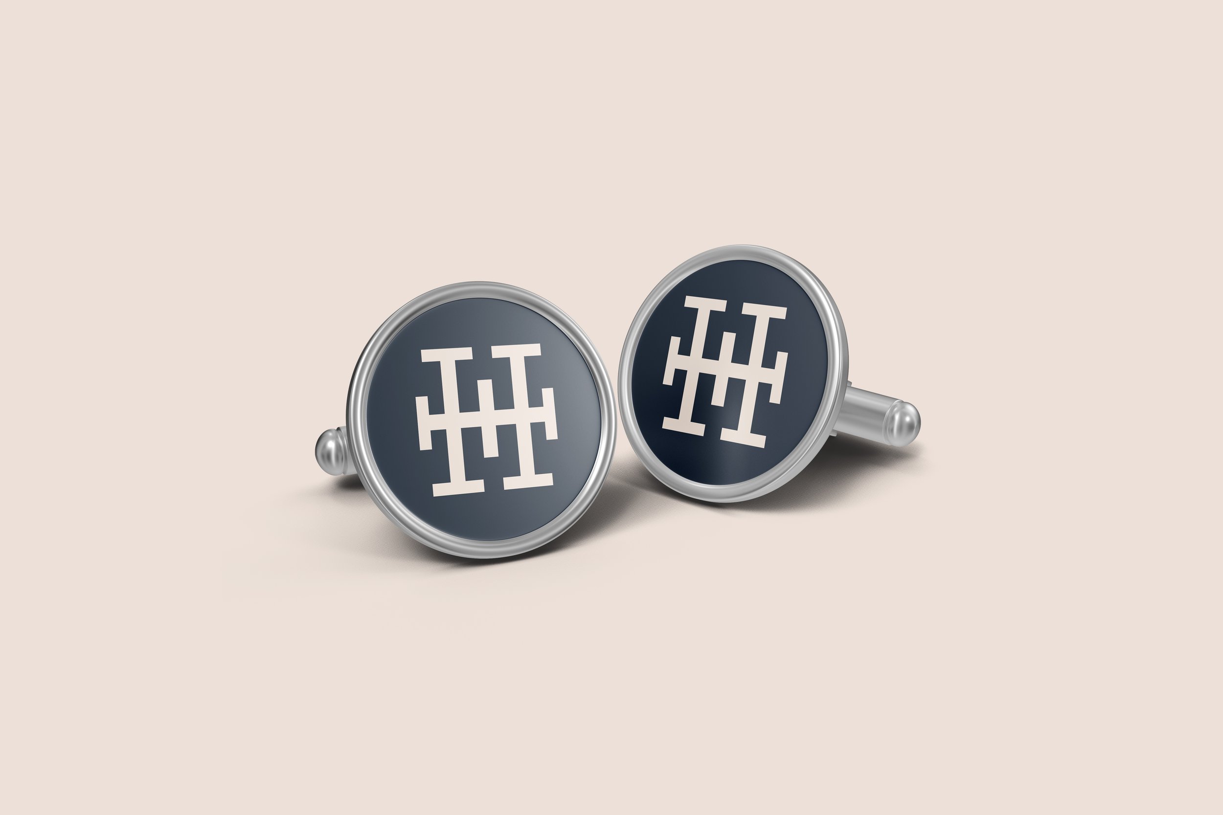
Designing the Logomark
When crafting the logo for "He Who Seeks," we explored several design concepts that could visually encapsulate the brand’s narrative. Ultimately, the client was drawn to a design that exuded both authority and elegance, yet felt modern and established.
The chosen logomark features:
a slab serif "H," designed to reflect the themes of exploration and discovery
bold serifs at the base of the letter suggest a robust foundation, symbolising the reliability and solidity of the brand.
the extended crossbar of the "H" stretches outward, signifying the brand's commitment to pushing the boundaries of the known and the ordinary.
balance in the logo’s structure represents the brand’s well-rounded approach to exploration.
he central crossbar, positioned like a beacon or a marked treasure spot, highlights the brand’s pivotal role in connecting its audience with enriching and luxurious experiences.
This strategic approach and thoughtfully designed logo encapsulated "He Who Seeks" as a brand that is both recognisable and distinct, ensuring its prominence in the bustling luxury market.
Consumer Behavior shapes the Website
Next, we explored the psychology behind luxury purchases, particularly focusing on the motivations behind gift-giving among affluent consumers. This research highlighted a common frustration among men about the limited options available compared to women, both for personal shopping and gift-giving.
We were intrigued by studies on Gifting Personalities and Practices, noting significant differences in how men and women approach gift-giving, including trends towards group gifts. These insights shaped our Customer Personas and influenced the design of a user-friendly shopping experiences.
Product Categorisation
To aid gift researchers, we introduced an extensive categorisation system that simplifies finding the perfect item by sorting products based on Personality, Occasion, Relationship, and Product Type. This system not only streamlines the selection process but also enhances the overall shopping experience by allowing customers to intuitively match products to the recipient’s profile or occasion.
Product Imagery and Descriptions
We conducted a detailed analysis of how products are displayed online, reviewing over 100 items from the extensive range of "He Who Seeks." Our goal was to differentiate our product presentations from other websites by focusing on lifestyle imagery that resonates with viewers. Additionally, we crafted deeper, more engaging product descriptions centred on the end customer. These descriptions clearly articulate the benefits of each product, enhance the storytelling aspect for the gift receiver, and distinctly highlight key details to aid in the decision-making process.
Group Buying
For group gift purchasers, we drew inspiration from shared payment options seen in services like Airbnb. We implemented a checkout system that allows buyers to split payments, easing the logistical burden and expediting the purchasing process.
As "He Who Seeks" continues to evolve, they are committed to using our research to refine their systems to further enhance the user experience, making every interaction with the brand seamless and enjoyable.
Sharing their knowledge with customers
Some brands gatekeep valuable information that could benefit their customers. Instead, this research we find should be viewed as a goldmine of content that can be shared to build a community. To initiate the launch of "He Who Seeks," we crafted three articles based on our research, designed to help their customers navigate the complex world of gift buying. These pieces not only establish the brand's authority in the market but also boost its search engine visibility. As "He Who Seeks" continues to produce and share valuable content, their growth will naturally follow.
If you're interested, explore these articles through the following links:

Setting up for the Future
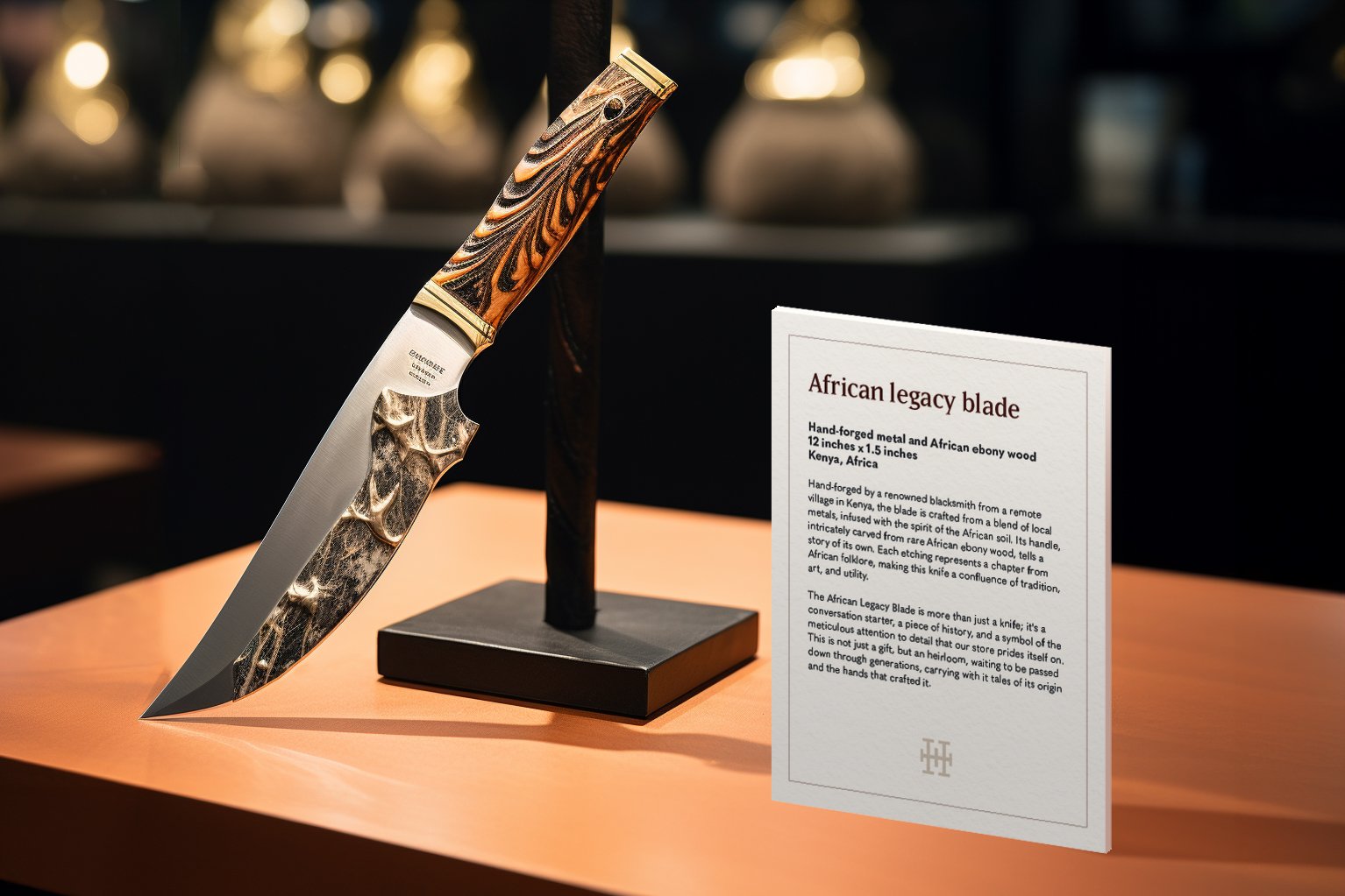
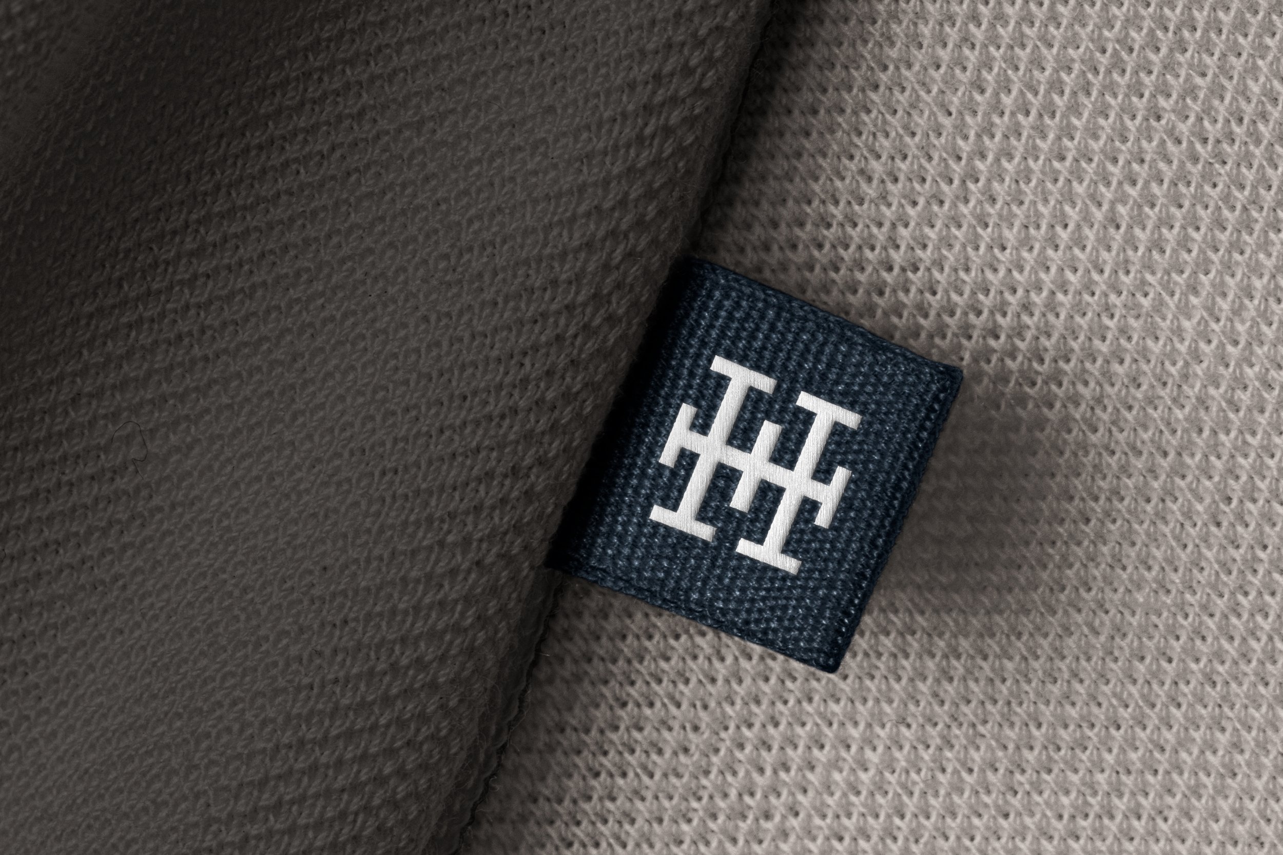
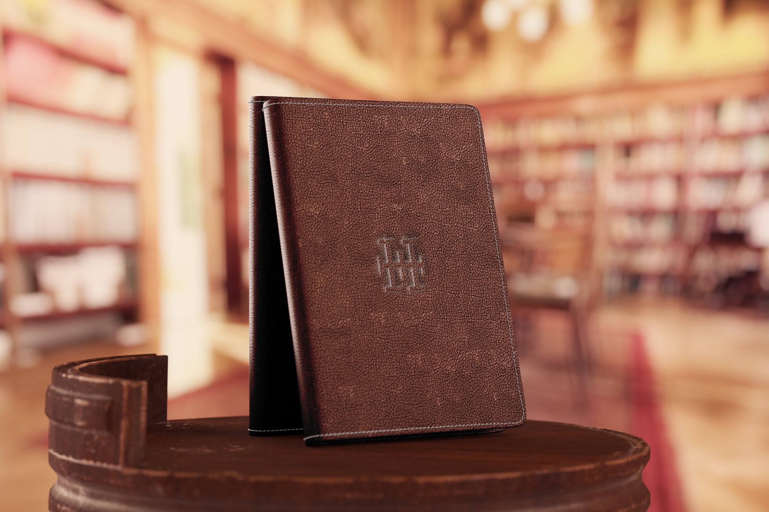
Pepe, the founder of "He Who Seeks," is not just running a business; he's building a vision for substantial growth. A crucial aspect of this vision involves creating realistic mockups for potential future products. These mockups are not based on whims; they're strategically crafted based on our comprehensive market research to ensure feasibility and optimal design.
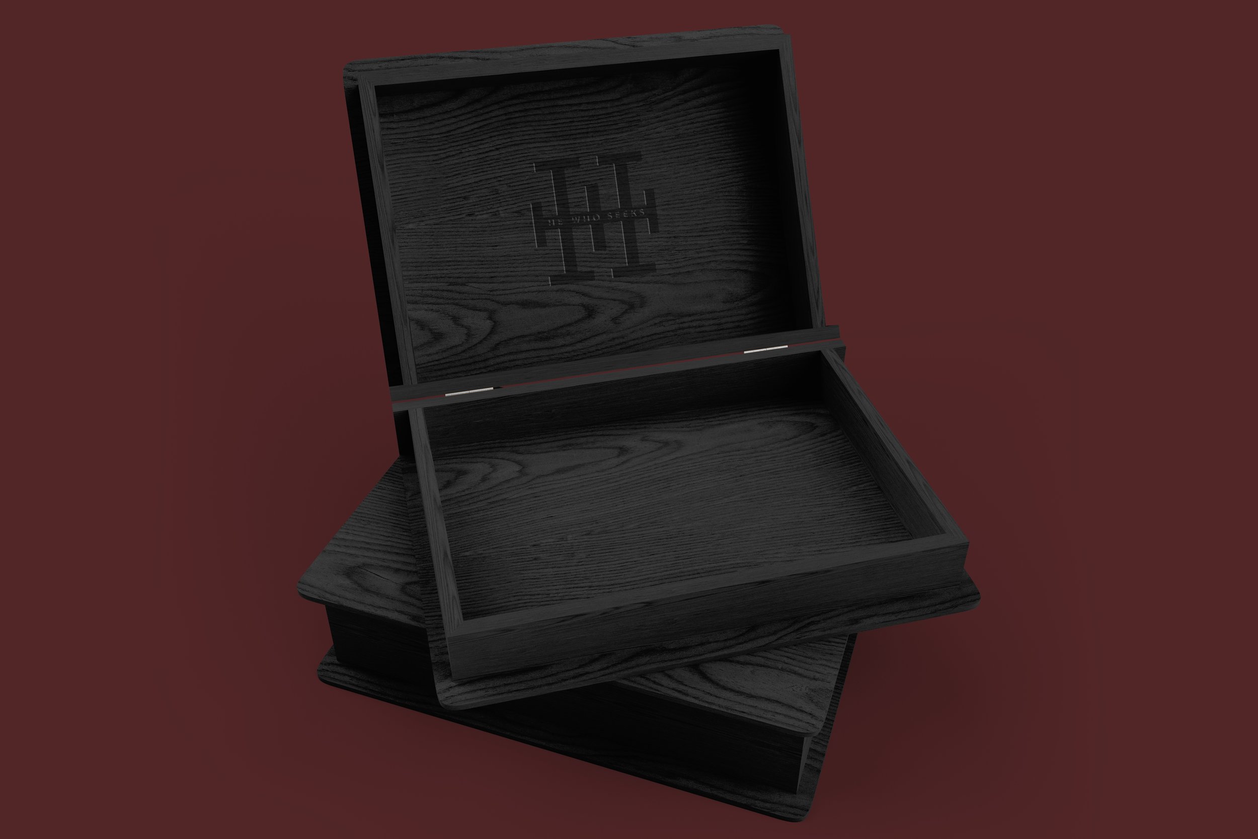
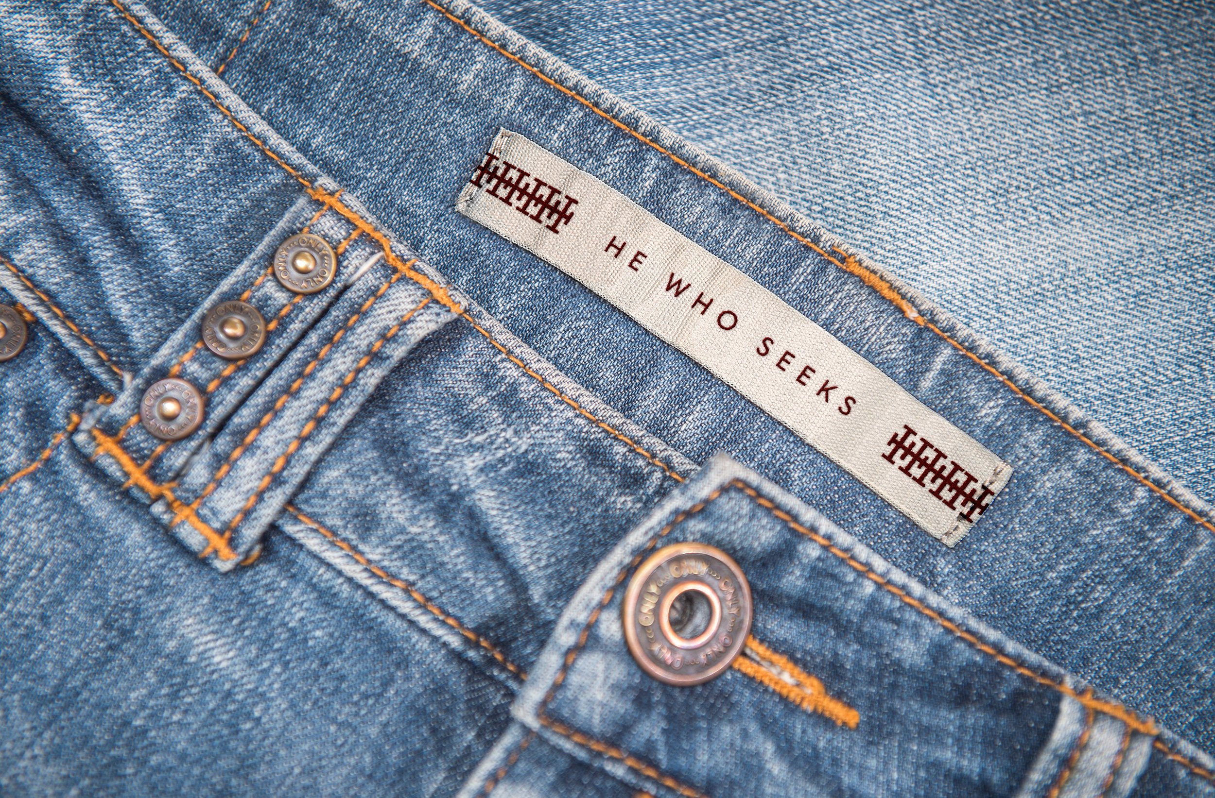
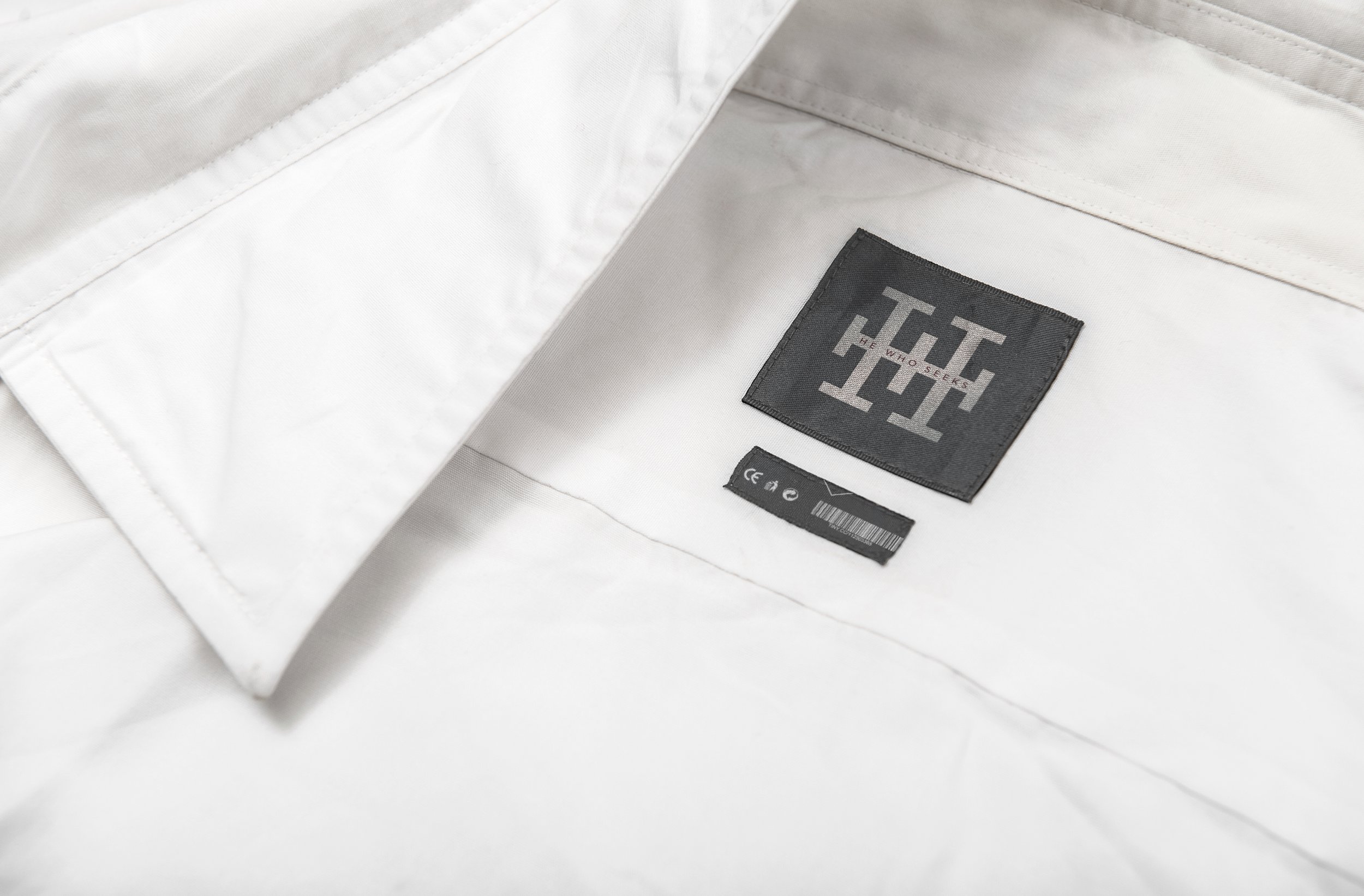
Here are examples of our mockups, including:
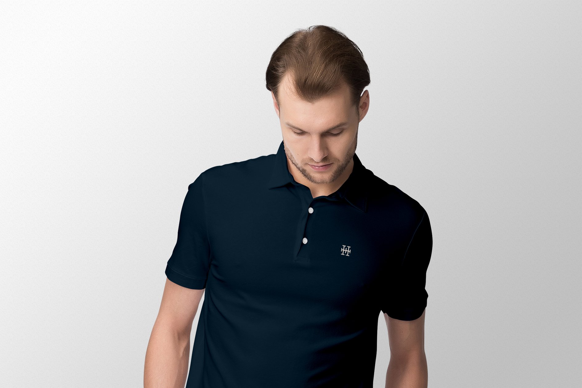
Branding Tags: For future product lines that resonate with our brand's essence.
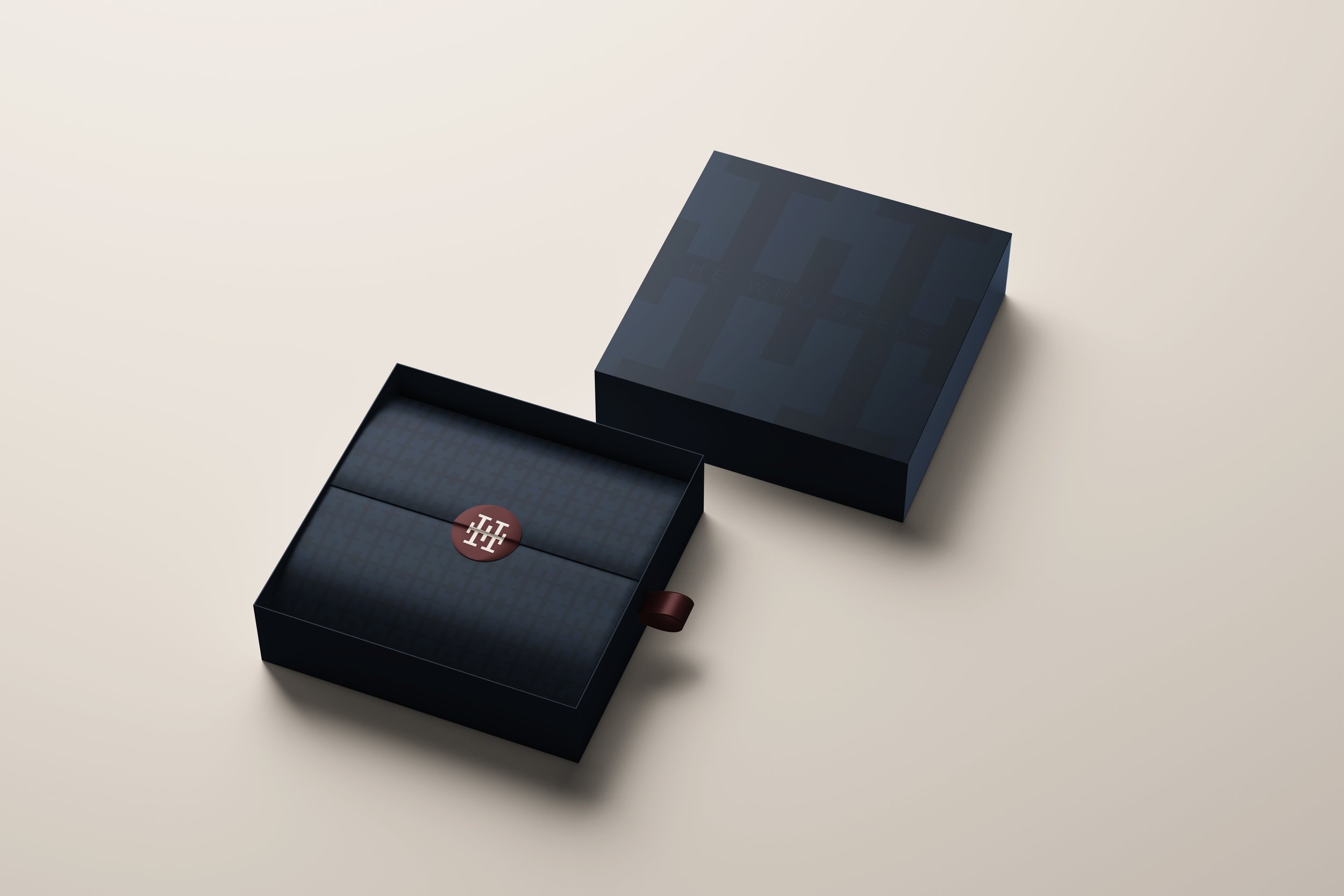
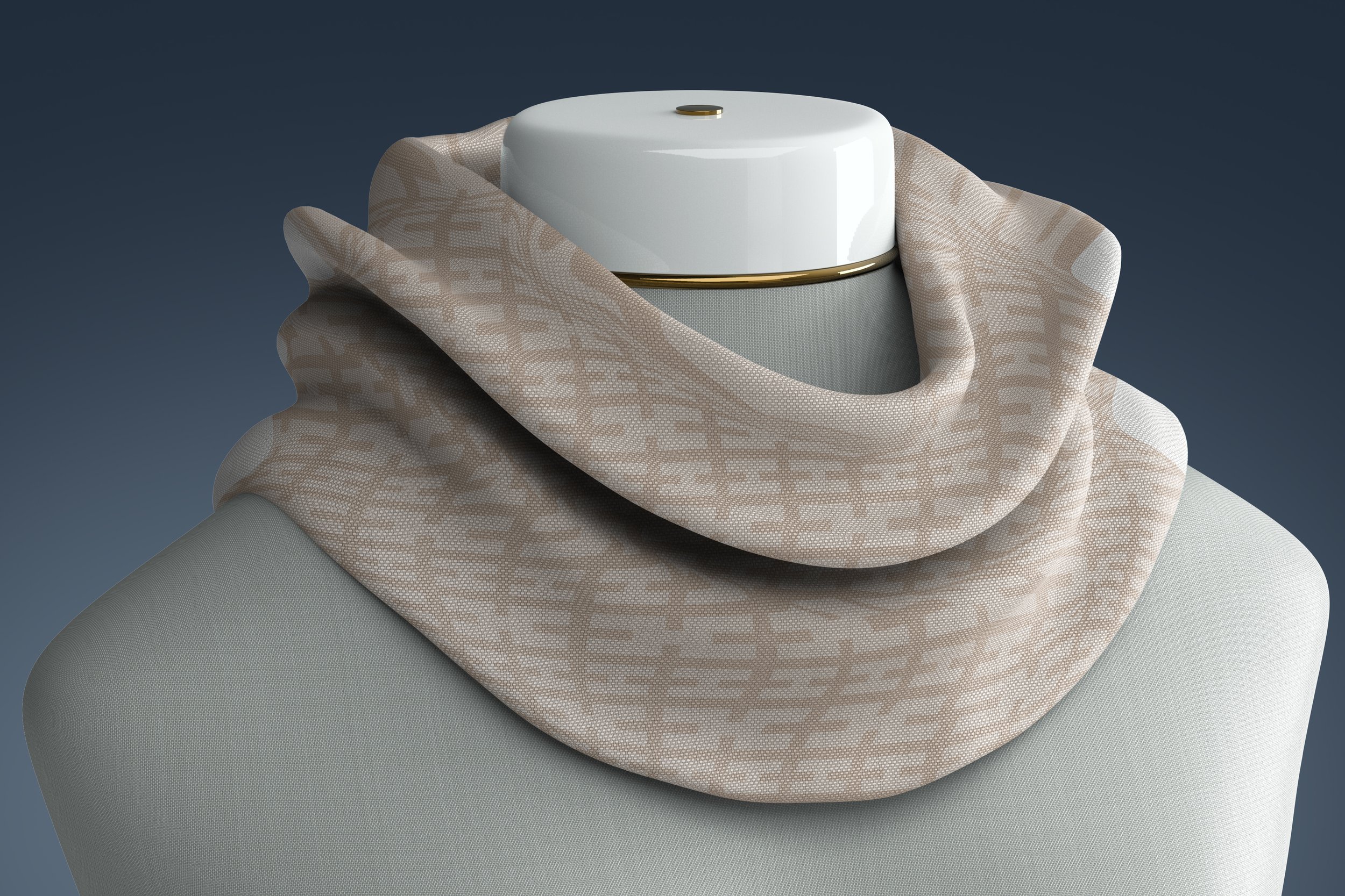
Custom Patterns: Designed for unique packaging and product enhancements.
Description Cards: Similar to those found in art museums, these cards add a touch of luxury and informative value to each product.
Store Signage: To welcome and guide future visitors in style.
Gift Packaging: Streamlining the gifting process by integrating elegant packaging solutions.
Social Media Posts: To engage and grow our community online.
Apply these learnings to your business
We encourage you to reflect on these insights and consider how market research might benefit your own business. Whether you're contemplating a rebrand or looking to refine your marketing strategies, remember the power of informed decision-making and innovative design. Reach out to us to discuss how we can help elevate your brand, or follow us for more updates and professional tips. Together, let's turn vision into reality.


