@AuManufacturing - Elevating Award Events with Smart Design
“I’ve been collaborating with Studio Riz for many years. Their initial work helped us to establish a brand identity we could finally be proud of, and which made our media kit, signage at events and other communications material shine.
We debuted our awards program in 2022/23, and Studio Riz was masterful in guiding us through and then executing on what was needed for a slick-looking campaign, and one which ended up getting traction much more widely than we’d hoped. The following year we brought Australia’s 50 Most Innovative Manufacturers back, making everything bigger, more deliberate, and – of course – better-looking than the first time around. Again, there is no way it would’ve happened without the guidance, vigilant eye for any detail that wasn’t good enough, and design chops of our partner.
The recent enhancements really took the project up a level, and we’re certain we’ll be able to say that again next time around. The professionalism and creativity they bring to every endeavour are truly exceptional.”
Services
Event Branding
AI Image Generation
Custom Online Forms
Certificate Design
Report Design
Process Optimisation
Content & Copywriting Assistance
Strategy Assistance
Impact
Elevated perceived value of awards
Simplified decision-making with streamlined processes
Boosted participant credibility with professional medallions
Attracted higher-quality sponsors
Strengthened industry connections and recognition
Improved efficiency in event execution and planning
Want to learn how to elevate your industry events? In this case study, you’ll discover the key lessons we learned over two years of designing, refining and collaborating with @AuManufacturing for their annual innovator awards.
In the fast-paced world of manufacturing, innovation is key. Recognising this, @AuManufacturing hosts an annual awards event to celebrate the industry’s most innovative players. In collaboration with Studio Riz, the awards underwent a significant transformation from their first year to their second. This case study explores the journey of refining the event's design, highlighting the lessons learned and offering valuable insights for other organisations aiming to enhance their industry events.
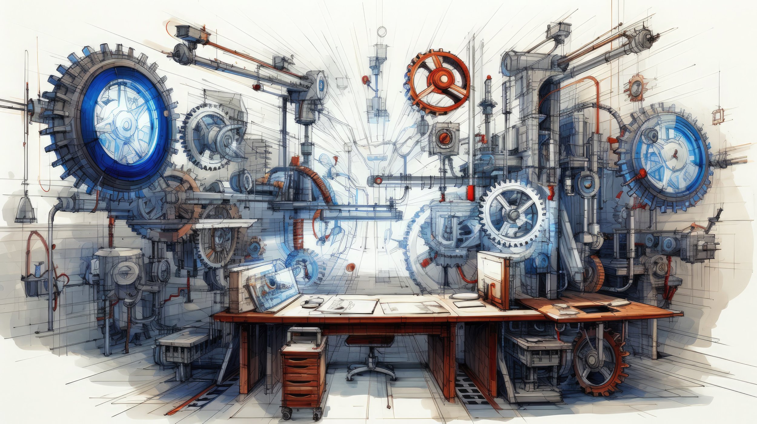
AI-generated imagery from Year One, featuring a sketch style to reduce noticeable artifacts.
AI-generated imagery from Year Two, showcasing higher-quality artwork due to technological and skill advancements.
In Year One, we assisted @AuManufacturing with the report’s format, content plan and created AI-generated sketch-style artwork.
Year One: Building the Foundation
In the first year, Studio Riz was tasked with designing several key elements for the awards:
Event Logo: The initial logo featured the Hammer icon embedded within the ‘0’ of the "50 Most Innovative Manufacturers" banner. This created a strong visual connection to the brand.
AI-Generated Imagery: These images were created for articles and social media to raise awareness and promote the event. We found this technology extremely powerful for eliciting conceptual ideas in a visual format. With the technology in its early phases, we opted for the hand-sketched style to create continuity and minimise noticeable artifacts.
Web-Based Entry Form: Designed to embed on their website, we crafted a form from a judge’s extensive questionnaire. Increasing the level of resistance to entry helped weed out poor entrants. To ensure the form felt manageable, we split it into separate sections, creating a sense of progression. Once completed, these entries populated a spreadsheet and sent individual entries to a specific judging email account.
Digital Award Medallions: Winners often want to showcase their achievements. To facilitate this, we created a 1:1 sized icon of their award, opting for a medallion style featuring the hammer logomark. This prominently highlighted @AuManufacturing as the event founder. In ideation we suggested broadening the scope of the awards to include special category winners, further enhancing the event's prestige.
Physical Certificates: Beyond the digital winning mark, a physical certificate serves as a tangible award to display in an office, boosting morale and earning the respect of visitors. We developed a system to data merge the names of all 70+ winners from a spreadsheet into individual certificates, ready for the Au Manufacturing team to print and sign.
Awards Report: A summary of the event serves as a memento for winners, a reminder of those they networked with, and a promotional tool for companies. Alongside the design, we assisted @AuManufacturing with a content plan for the report, introducing the awards, judges, criteria, winners, and pioneering companies.
Our challenge in this first year was that we were “building the plane as we were flying it.” While this approach ensures completion, it also meant elements were developed in isolation. When it came time to design medallions and winner certificates, our focus on promoting the main brand with the hammer logomark and ‘manufacturer’ words led to redundancy and overcomplexity. The elements didn’t seem unified when separate and were cluttered when together. We found ourselves constrained by the work we had already completed, necessitating a more integrated approach in the future.
In Year Two, while the report format remained largely unchanged, the revised logo stood out more prominently, and we further elevated the report with advanced AI-generated imagery.
Top 10 Gold Award Certificates for 2023 and 2024. Notice the cleaner look in Year Two, small changes can make a big difference.
Year Two: Refinement and Professionalism
With the benefit of hindsight, both Studio Riz and @AuManufacturing took the opportunity to reflect and refine our approach. The second year’s design saw a significant upgrade, marked by several key improvements:
Streamlined Logo: Drawing inspiration from the iconic work of Saul Bass, we redesigned the event logo to feature a gear element that doubled as a 1:1 sized medallion for winners. To avoid a clichéd look, we designed the gear with outward-fanning teeth, providing a fresh and modern aesthetic. The hammer icon was retained within the ‘0’, but in a more subtle and integrated manner, harmonising seamlessly with the original brand logo. The “Most Innovative” text could now be used either within the gear or separately, allowing for versatile and clear branding across different materials.
Enhanced Imagery: Advances in AI technology and our improved skills enabled us to produce high-quality CGI-style images that were visually striking and cohesive, setting a new standard for the event’s promotional materials. We consulted closely with @AuManufacturing to understand their vision to incorporate various types of manufacturing, including transportation, machinery, medical, nuclear, and fulfilment.
Simplified Medallions and Certificates: The new medallion design was straightforward and elegant. The certificates, now cleaner and with fewer repetitive elements, improved both visual appeal and production efficiency.
Consistent Awards Report: We refined the awards report to match the new design theme, resulting in a more visually appealing and professional document.
These improvements made decision-making easier and resulted in a cohesive, professional-looking event. Each design element harmonised with the others, presenting a unified and polished image.
Impact and Success
The design elements from both years had a profound impact. In the first year, participants eagerly shared their success, featuring the initial medallion images and gaining significant visibility. This initial buzz helped establish the awards' credibility. By the second year, the refined design elements amplified this effect, with participants proudly showcasing the updated medallion images across their networks. This not only further boosted their credibility but also significantly enhanced the perceived value of their awards. The polished, professional appearance in the second year attracted stronger sponsors, proving the concept’s viability and setting the stage for even greater success in the future.
Lessons for Other Organisations
Studio Riz’s work with @AuManufacturing highlights the importance of thoughtful design in achieving great results for all types of business events. Here are some key takeaways for other organisations:
Community Building: Events like these foster collective growth within the industry, offering recognition to both organisers and participants, and strengthening the entire community.
Value of Iteration and Reflection: Embrace the process of making significant changes to enhance overall impact. Learn from past experiences to drive future success.
Create a Design Checklist: Develop a comprehensive list of essential design elements for your events, including logos, entry forms, promotional materials, banners, trophies, slide decks, event videos, and more. This ensures nothing is overlooked.
Importance of Cohesive Design: A well-structured checklist and concurrent development of these elements lead to a cohesive design. This enhances credibility and professionalism, attracting better participation and sponsorship.
Nomination form designed by Studio Riz
Year One Digital Medallions. The slick metallic coin design was overshadowed by the overwhelming surrounding text.
Year Two Digital Medallions. By incorporating the event name into the logo and medallion, less surrounding text was needed to explain the award.
Ready to transform your events?
For more information on event design, explore our article on conference design here.
Alternatively, schedule a free consultation below, and let Studio Riz assist with your next event. In our initial meeting, we can showcase some of our previous work and strategies to demonstrate what’s possible.


