Zelrose’s IT Makeover: Rebranding a Side-hustle to Sector Sensation


“From the outset, I felt a deep connection with your approach. The transformation from Z-Tech Solutions to Zelrose was more than a rebrand; it was a journey to discover my true vision and showed me everything I was capable of. Your dedication, collaboration, and genuine interest in my success have been outstanding. I’m truly grateful for the mark you’ve left on Zelrose and for the partnership we’ve built. Thank you for setting me up for success!”
Services
Brand Naming
Market Research
Brand Messaging
Brand Strategy
Website & UX/UI Design
Copywriting & Blogs
Store Fitout and Signage
AI Image Generation
Promotional Marketing
Business Strategy
Marketing Strategy
Impact
Crafted a globally unique name that’s memorable, searchable, and distinct in a saturated market.
Enhanced business opportunities with higher quality leads and securing large contracts.
Founder is proud and invigorated about his business's direction
Authentic customer interactions are created by the brand visuals and story
Customers are eager to participate, share and recommend the brand
Designed with flexibility for growth and diversification
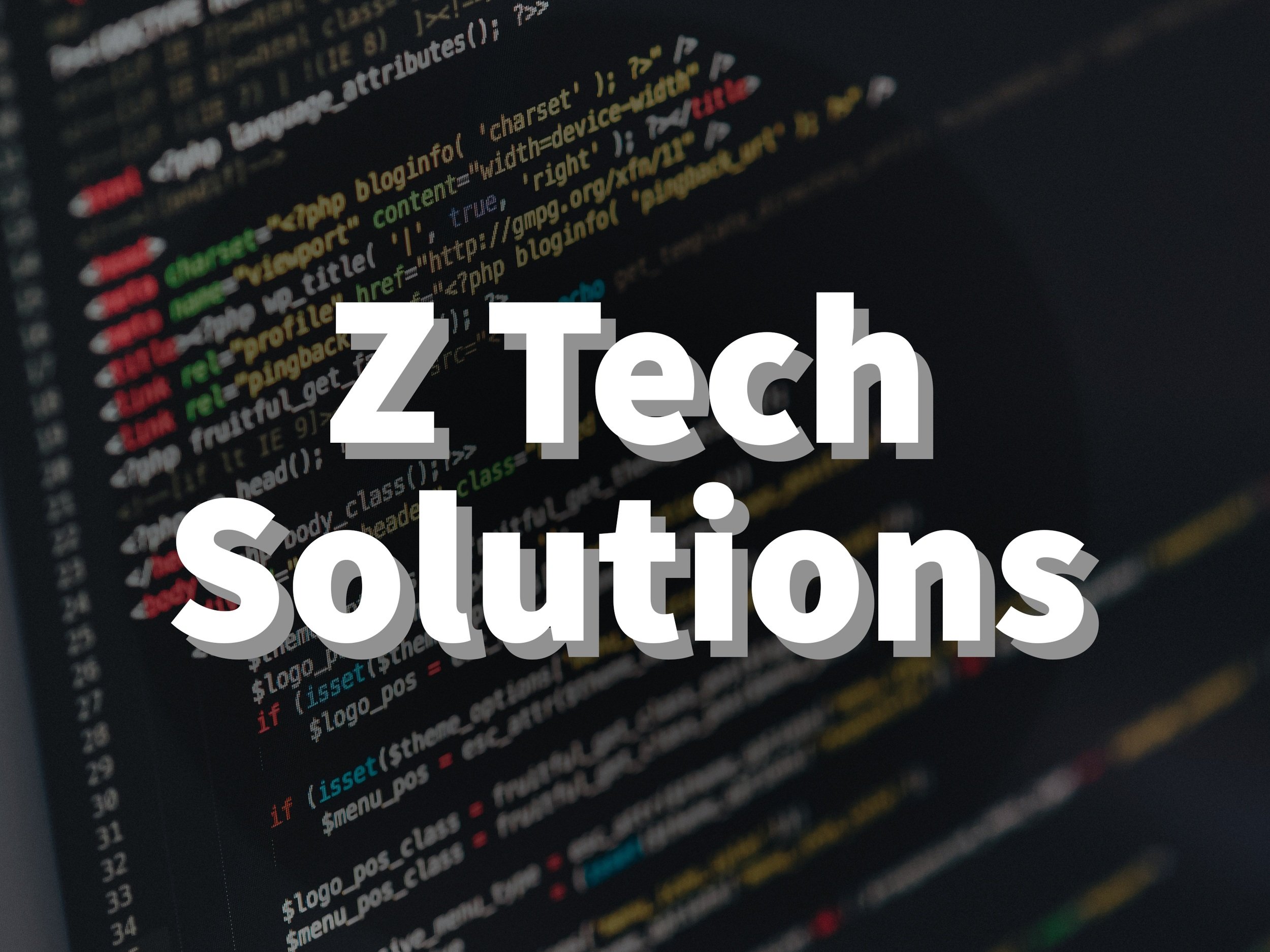
In the dynamic realm of IT services, creating a distinctive brand identity is paramount. Zaidyn, the visionary behind Z Tech Solutions, recognised this need for evolution. With Studio Riz at the helm, Zaidyn's entrepreneurial journey took a transformative turn, giving birth to Zelrose.
Dive into this captivating rebranding journey, from the inception of a new name to the creation of a memorable mascot, and discover how research and collaboration were the cornerstones of this brand metamorphosis.
Understanding the Past
Zaidyn, the owner of Z Tech Solutions, had taken a break from his freelance IT services business. He had a stint working in the Queenstown, New Zealand holiday activity sector.
After returning to Sydney, Zaidyn aspired to shift his IT business from a side hustle to a full-time endeavour. Yet, the initial branding for Z Tech Solutions, crafted by a younger Zaidyn, didn't convey the professionalism needed to appeal to a wider audience and more sophisticated clientele.
He wanted his business to evolve and recognised the need for more effective branding. This led him to approach Studio Riz for a rebrand, a design expert would better assist in his business development.
The Rebranding Process - From Name to Narrative

Finding the Perfect Name
We identified early on that the original name, "Z Tech Solutions," was too common an IT business name structure in Australia. This meant Zaidyn’s business was already disadvantaged in standing out in the market. It also didn't capture the personalised service Zaidyn provided.
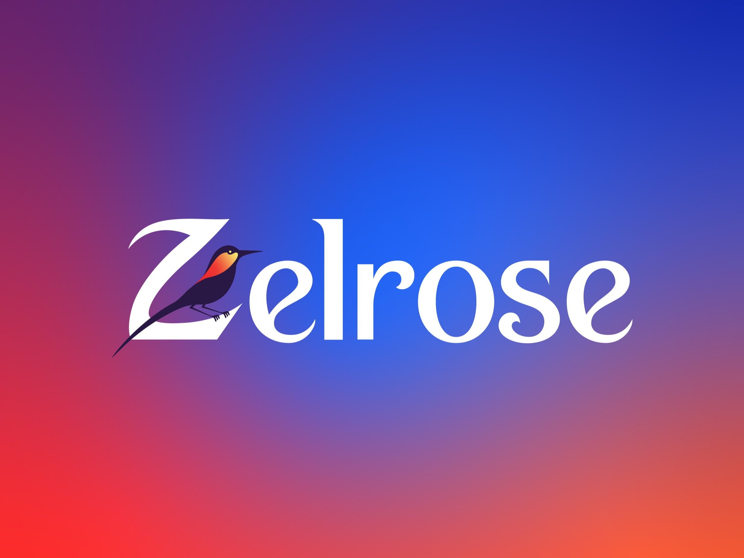
We set out to find a new name that was still personal to Zaidyn, after all the original name was self-referential. This is why we drew inspiration from Zaidyn's surname, "Melrose," which originates from a Scottish town.
To maintain the unique character of the letter 'Z' from the original name we blended it with the legacy of 'Melrose,' the name "Zelrose" was born.
The choice of “Zelrose" was particularly apt for several reasons:
Personal Connection: The name drew inspiration from Zaidyn's adopted surname, "Melrose." This personal touch ensured that the brand had a deep connection to Zaidyn's identity, making it more authentic and meaningful yet distinctive to him.
Uniqueness: While "Melrose" was associated with various businesses in Australia, the addition of the 'Z' was found to be unique globally. This uniqueness ensures easy discoverability in online searches and helps the brand stand out in a crowded market.
Memorability: The combination of the distinctive 'Z' with 'elrose' makes the name catchy and easy to remember. A memorable name aids in brand recall and fosters customer loyalty.
Versatility: The name "Zelrose" is versatile and doesn't pigeonhole the business into a specific niche. This allows for potential growth and diversification in the future without the need for rebranding.
Resonance with Brand Values: The name encapsulates the agility, precision, and personalised touch that Zaidyn wanted his IT services to be known for.
Global Appeal: The name doesn't have any specific linguistic or cultural connotations that might limit its appeal. It's neutral and has the potential to resonate with a global audience.

Sneak peak at the signage leading to the new Zelrose store. See how we placed the swallow on the upper portion of the shop front upstairs so you can follow the bird from the ground floor to your final destination.

Choosing the Mascot:
Melrose the place, played a significant role in shaping the brand identity, resulting in the unique and memorable brand name "Zelrose." However, whilst deep diving into the history, flora and fauna of the area, the team was drawn to the swallow, a bird admired for its agility, precision, and sociability. These qualities resonated with the spirit of Zaidyn's IT business, hence we proposed to use this as a mascot for the business.
Using a mascot is a great design choice for several reasons:
Memorability: Mascots are visually distinctive and easily recognisable for customers. They can set a brand apart from competitors and make it instantly identifiable. This was especially true in the IT market which is filled with imagery of circuit boards and electricity.
Emotional Connection: Mascots can evoke emotions and create a personal connection between the brand, its founder and customers. They humanise a brand, making it more relatable and approachable.
Versatility: Mascots and their qualities can be used across various marketing materials in creative ways. As an example, we created a blog called “Tech Chirps” and adapted the idea of a bird leading you through a forest by similarly using the swallow to guide people to the Zelrose store (see our sneak preview). Their adaptability can help ensure brand consistency across different mediums whilst having new and interesting interactions.
Storytelling: A mascot can be imbued with a backstory, values, and personality that align with the brand's mission and vision. This storytelling aspect can further deepen the bond with customers and provide a narrative that resonates with them.
Engagement: Mascots can engage audiences in unique ways, such as interactive campaigns, animations, or social media posts. They can be a focal point for marketing strategies, driving user interaction and engagement. The mascot also elicits organic conversations, which in this case helped Zaidyn build rapport. A lot of customers would ask what the swallow means. After Zaidyn explains they always say “That suits you so well!".

Google SEO Keyword Research
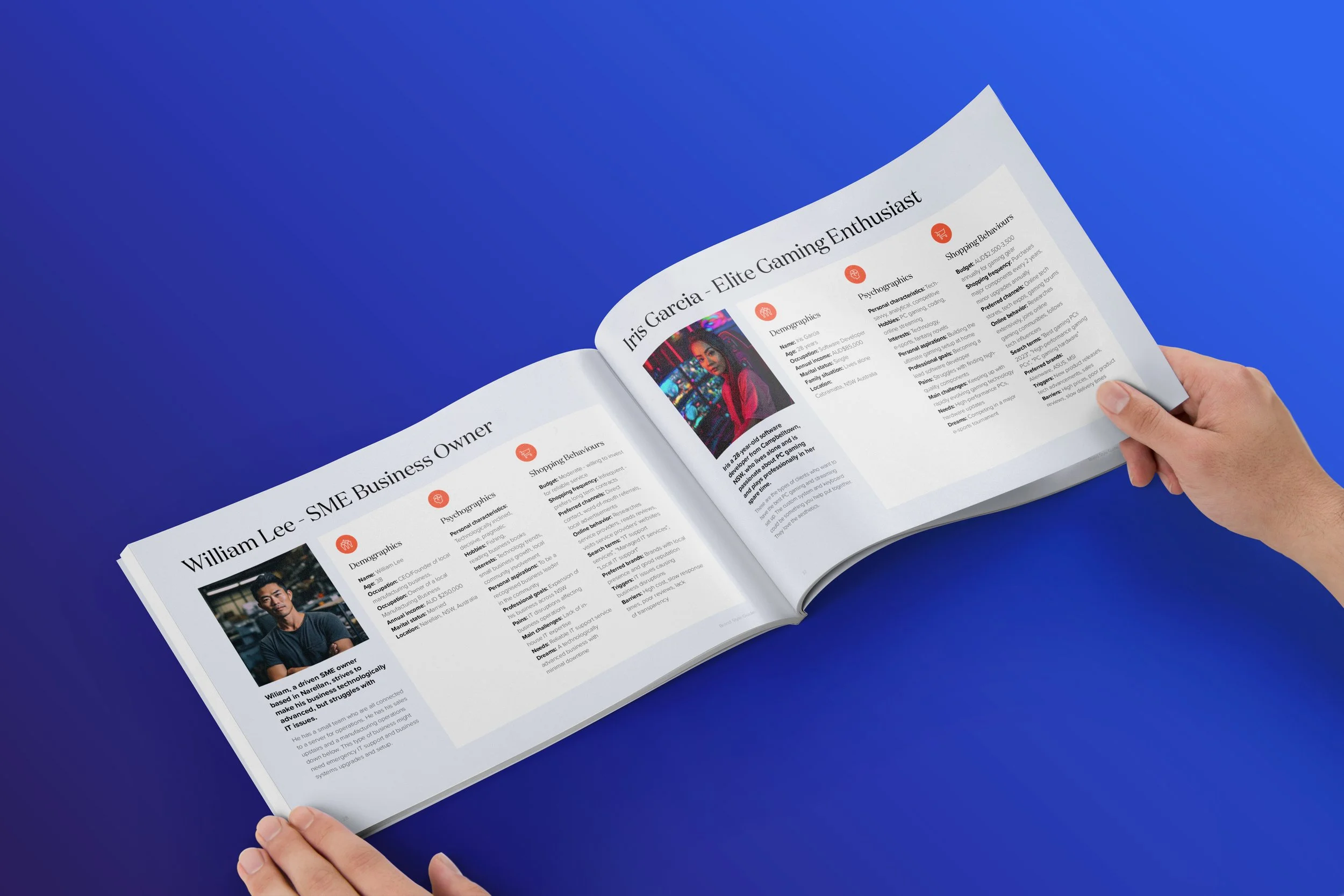
User Profiles are used to make sound marketing and business decisions
Importance of Market Research and its Influence on Brand Identity
Market research was pivotal for understanding the competitive landscape and identifying unique opportunities for differentiation. By conducting Google Keyword Research, Competitive Audits, and crafting User Profiles, Studio Riz acquired a deep understanding of the target audience's desires and needs. This exploration illuminated gaps in the market and highlighted areas where Zelrose IT could distinguish itself.
It was determined that there was a significant demand for IT services in the residential and commercial sectors. Additionally, an emerging and largely untapped gaming market was identified, presenting a potential avenue for substantial growth.
Clients were seeking quick, reliable, on-time, and straightforward IT solutions. With this in mind, the brand was shaped to highlight these attributes, ensuring alignment with customer expectations.
Armed with this knowledge, Studio Riz designed a brand identity that resonated with prospective clients. We reinforced the brand's commitment to meeting consumer demands and provided clear direction for the business's future growth and offerings.

Pages from Zelrose’s Brand Guideline.
Crafting a Visual Identity
From here we conceptualised three concepts, a friendly IT service, an abstract hi-tech aesthetic and an e-sports style. Ultimately, we blended these ideas, emphasising the approachable art style, pairing it with the professional typography seen in top-tier businesses, and infusing the lively colours/gradients from esports and Instagram. Zelrose's logo emerged as a modern emblem of reliability and innovation. Research consistently serves as our compass, ensuring we make informed and objective decisions in our branding endeavours.

Preview of the Zelrose website
How we built a High-Quality Website with Startup Resourcing
We opted to host Zelrose's website on Squarespace, to facilitate Zaidyn's ease in updating blogs and utilising the customer appointments feature.
The website's navigation was specifically designed to emphasise Zaidyn's primary service areas, Residential, Commercial, and Gaming IT Solutions; in line with our market research findings. Additionally, we incorporated a blog section to offer solutions and resources to his clientele and an "About Us" page detailing Zaidyn's journey and the brand's inception.
A significant challenge we encountered was the infancy of Zaidyn's business, where high-quality visuals are crucial for establishing professionalism. While stock images offer a professional look, they often lack a personalised narrative. Given the constraints of accessing a photographer, suitable locations, equipment, props, and even pending uniforms, we leveraged our expertise in AI-generated photography. This included creating face-swapped images of Zaidyn, enhancing the website's aesthetics.
Interestingly, this process led Zaidyn to discover a new hairstyle he's keen to adopt!
Lead Generation, Customer Feedback & Ongoing Support
We periodically touch base with Zaidyn, offering continuous guidance to foster his business expansion. He has initiated modest marketing efforts that have significantly boosted enquiries. A custom PC giveaway attracted immense attention, garnering hundreds of entries within just a few days. Despite being a new business, he's witnessing impressive revenue growth.
In addition, the Zelrose branding and flyers stand out as distinctive, appealing, contemporary, and professional without being overly corporate, particularly suited to a local market like the Central Coast in NSW, which serves as the base of operations. As previously noted, this brand sparks discussions and authentic engagements with clients. Many remark on the vibrant colours and are curious about the swallow symbol.
The community now views Zelrose as a legitimate business and sees it as a dependable service provider in the area. Zaidyn is amazed that he now receives enquiries from prominent companies with 500+ employees who are interested in his services. This showcases the opportunities that a revamped professional brand can bring.


Next Stop, Designing his Store!
Exciting times are ahead for Zelrose! In the midst of the design process, Zaidyn informed us that he was going to open his very first store. It’s currently slowly getting built out as Zaidyn establishes himself. We will check in with him again once it’s complete and go more into the process of how we translated his brand into a physical space.
Stay tuned!
What Made this Brand Redesign so Successful?
The significance of research in guiding one's perspective and direction cannot be overstated. It's arguably the most crucial step in the design process, yet it's frequently overlooked by both clients and designers.
Equally vital is the client's active participation and openness to reevaluate their own ideas. Working with Zaidyn was a delight; he was deeply engaged, even contributing his own research and competitor analysis to collaboratively refine our strategy. This partnership thrived on mutual respect, acknowledging each other's expertise, and aiming to create something exceptional together.
The evolution from Z-Tech Solutions to Zelrose is not just a rebranding story. It symbolises recognising potential, welcoming transformation, and weaving a compelling narrative. Studio Riz is honoured to have played a role in this metamorphosis.
