
Pier 21 sale gets a brand refresh
A fresh design language elevated an older precinct, making it more attractive for sale and providing inspiration for the future owner.
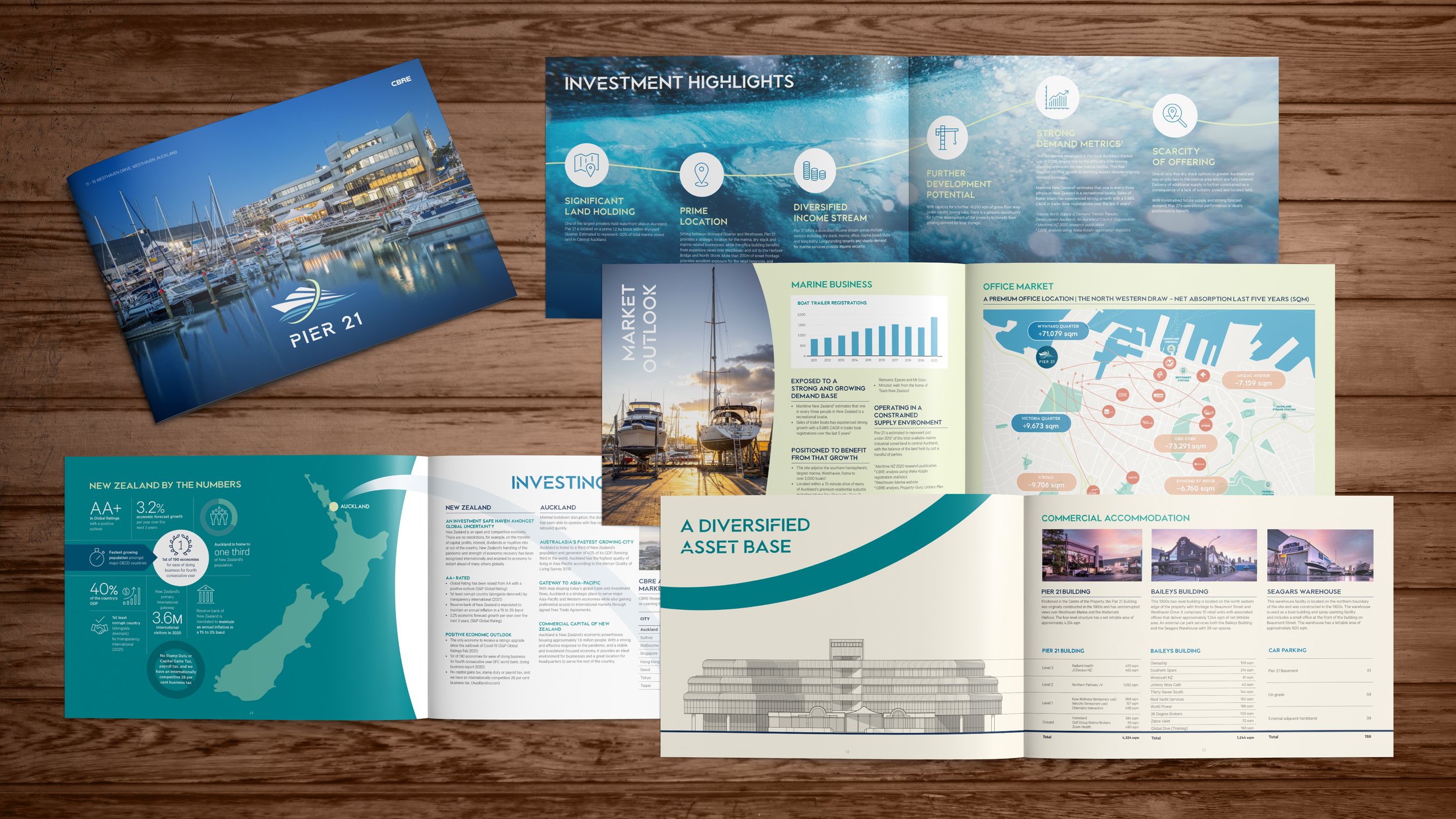
The aim of this brochure (information memorandum) and video, was to bring new life and perspective to the precinct. This property had so much to offer with an amazing location, views, amenities, boat yard and dry stack. The waterfront is also a natural source of movement; we felt this needed to flow into the project's branding.
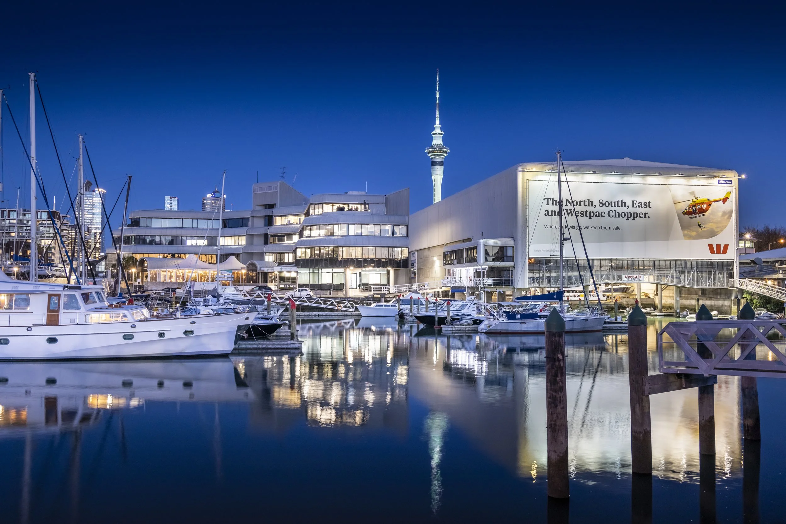
Our first start was planning the ground/drone photography and videography. We spent in-depth time planning the times of day to shoot getting some beautiful early morning shots. Next, we planned the fly zones from nearby parks to get the best shots of the property and including the Auckland city backdrop.
Moving on to the design, we began with a new logo, something the future owner could use or be inspired by to rebrand the property. Next, we incorporated a modern, more diverse colour palette to give some variation and pop. Finally, we utilised waves and curves as a creative motif in the layouts to bring that sense of energy from the shores.
In addition to the brochure basics, the team created a custom-drawn map of the region using the colour palette and icons. This was based on an amenities list and planning the area to draw. Our artists then meticulously redrew the main office building based on the aerial drone shots we took, as older elevation plans were hard to come by. We packaged this all up in an A4 landscape document that was carefully crafted to be easily read in a single-page and double-page book view, adding the flexibility for a premium print and/or digital viewing experience.
The final stage of the project culminated in the video. We planned the storyboard with the agents. They opted for lower thirds, and on-screen text instead of voice-over. We utilised the same wave patterns to bring in each snippet. Our editors devoted extra time enhancing the sound design. We added the sounds of birds, waves, mechanical movement of the dry stack and even small touches like the unlocking of a car to add a sense of immersion.
The agents ultimately used the site’s original logo for the final promotion as they realised it was most likely set for redevelopment. Here we show you the final product with our complete branding package.
Services
Branding
Information Memorandum
Videography - Ground & Drone
Photography - Ground & Drone
Video Editing + Motion Graphics
Scripting + Storyboarding
Mapping + Building Drawings
Impact
Sold to Winton Holdings ($749m NZX list company)
Plans for the redevelopment of the site as an extension to a future retirement village

“Studio Riz delivers outstanding quality design materials which respond to and enhance the assets we are marketing. They are efficient, responsive and a pleasure to work with. ”
Click here to watch the final video
On behalf of The University of Sydney, Colliers are pleased to offer this truly exceptional opportunity in the fringe of Sydney’s CBD. Well located within the affluent city fringe suburb of Glebe, the property is a significant and exceptionally rare city fringe freehold offering comprising of a versatile five level commercial office building with existing use rights and 43 marked car parking spaces. Positioned on the corner of Glebe Point Road and Leichhardt Street, this property benefits from an abundance of natural light, outstanding water views and street frontages casing the majority of the site.